5 Examples of Companies Rebranding
Slice Marketing's Graphic Designer, Alex, looks at 5 examples of rebranding that helped companies to modernise their brand identity.
The Two Types of Rebranding
There are two forms of a rebrand, in some projects the designer will start from scratch and this is certainly more difficult because if the new brand isn’t accepted by the business’s audience then it can have a damaging effect on their reputation. The other form of a rebrand is called a ‘brand refresh’ and this is more common as a designer will modify the existing logo to feel more modern and more suitable, often for the online and digital world.
There are definitely design traits from the late nineties and early noughties that are still common in brands to this day. These are most commonly heavy stroke lines on the logo or a drop shadow effect (which is the worst of them all!) As design has progressed, designers are minimizing their logo designs and most big brands have condensed their logos into simple icons. This is mainly due to apps where the logo needs to be easily recognizable and visible when you only have a small square canvas to work with.
That’s enough small talk for one blog post so let’s jump into the aesthetically pleasing before and after photos.
1. Mastercard
When Pentagram and more specifically Michael Bierut get their hands on a brand the outcome is always going to be amazing. Pentagram is the biggest design agency in the world hiring only the best designers with Michael Bierut being one of them. After a very unsuccessful attempt at a brand refresh in 2006 MasterCard decided to change again in 2016 and this result was much more accepted by MasterCard's customers and the design community.
Bierut decided to stick with the iconic two circles which represent the overlap of commerce between international powers, in particular, the East and West. However he modified the colours to make them appear warmer and more suitable for the digital age. Bierut also removed the interlinking lines between the two circles and placed the brand name below the circles as opposed to in the middle of them.
The typography is one of the main reasons that I love this brand refresh so much. I feel the choice of typography and the use of all lowercase letters really gives this brand a modern feel. Reinvention in the digital age calls for modern simplicity and that’s why the new typeface FF Mark does it’s job with the font weight being slimmer with curvature and spacing giving the text more legibility.
Recently, MasterCard evolved the brand even further by removing the type altogether and having the two circles as a standalone icon. In my design career I’ve always tried to follow this quote from french writer Antoine de Saint-Exupery: ‘A designer knows he has achieved perfection not when there is nothing left to add, but when there is nothing left to take away’. I feel brands are also following this quote too with most companies wanting just one simple icon or symbol to represent them.
2. BT
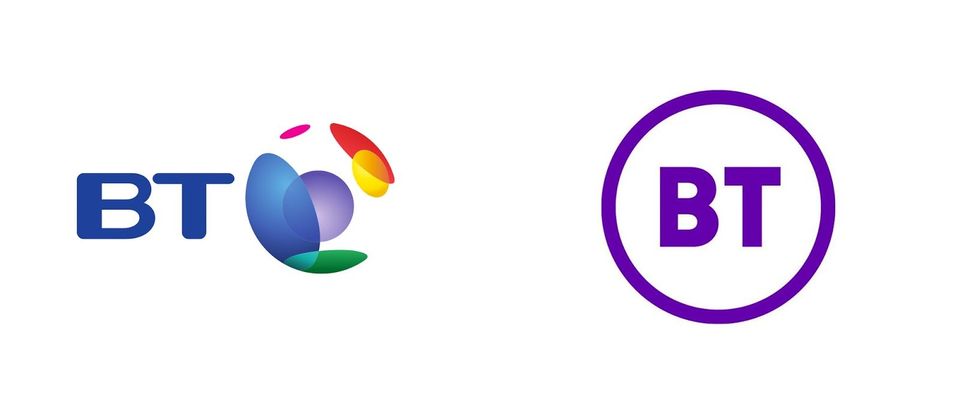
This rebranding first came to my attention when it was being ridiculed A LOT on Twitter with many people saying they could have done it in Microsoft Paint. Well that’s like saying you could write a novel in Microsoft Notepad.If you gave anyone a piece of paper I’m sure they could draw the Nike swoosh but then we all pay a lot of money to have it on our clothing. A good brand isn’t about being flashy; most inexperienced designers try to use every effect or design trick imaginable in Photoshop or Illustrator, whereas there’s no substitute for experience, which usually results in more refined and precise work.
Before BT went for this re-brand they had countless different logos and identities and it just felt a mess but this rebrand gave BT a strong icon that was the umbrella for all their services like TV, Broadband etc.
"Some people looked at it and said 'it took four years to do a logo that's two letters and a circle', but really it takes four years to go around a business of that size, and to make sure everyone's happy and comfortable with it, and to show why it's right for them," said Franklin (the designer for this project), a sentiment we strongly agree with here at Slice.
"It sounds silly talking about two letters and a circle, but the real thinking behind the design was that we wanted to create a symbol – something that would appear like a quality mark or Kitemark."
Ultimately, less is more in this digital age and a flat simplistic icon will serve BT for many decades.in my opinion the colour scheme of BT’s new icon is already recognisable. This rebranding has to be deemed a success so hat’s off to Paul Franklin and Red&White for having the confidence to be so simplistic.
3. Brentford Football Club
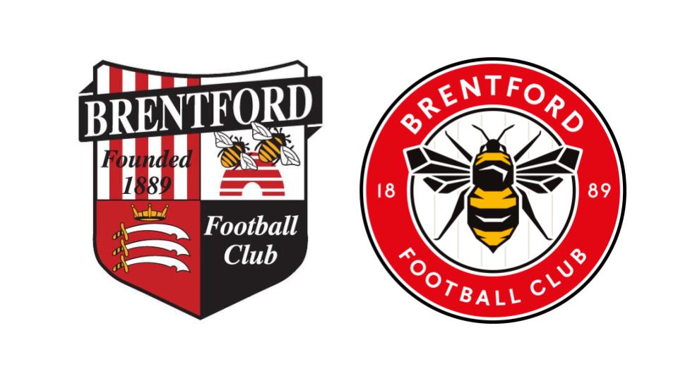
When I was around 16 years old, I remember doing a logo for Scarborough FC and obviously I wasn’t that experienced but I felt the outcome was an improvement on what they had - but wow there was uproar! I remember having to mute my Twitter app from the abuse from the fans. It didn’t help Scarborough FC tagged my personal Twitter account in their launch post but this was for a club with a relatively small following!
Football clubs are a tricky one to rebrand with fans having a strong affection for the current badge and all the history that goes with it, so this rebranding deserves more respect than the typical business rebranding. As a designer with OCD I can say in my opinion that most football badges are a design disaster, including the old Brentford badge. That said, they are so ingrained in our minds and we just accept them,usually rejecting any sort of change. That’s why this rebranding is such a rarity because the transition seems so smooth. I can’t recall seeing or hearing any backlash from this change.
I think the reason it was successful is due to the bee remaining on the logo, therefore maintaining some identity and club history. They also made the logo brighter and more friendly by using red as the dominating colour and using black as more of an accent colour.
The bee has been drawn in a isometric symmetrical way, which is very satisfying for us OCD-ers out there. The typography works well too; it’s an underrated skill finding the perfect typography for a circle logo. In my early days designing I can’t tell you how many hours I spent trying to find fonts for a circle logo without it looking off balance. The spacing of the type complements the logo too giving all the elements of the badge room to breathe unlike the old badge, which had everything squished together.
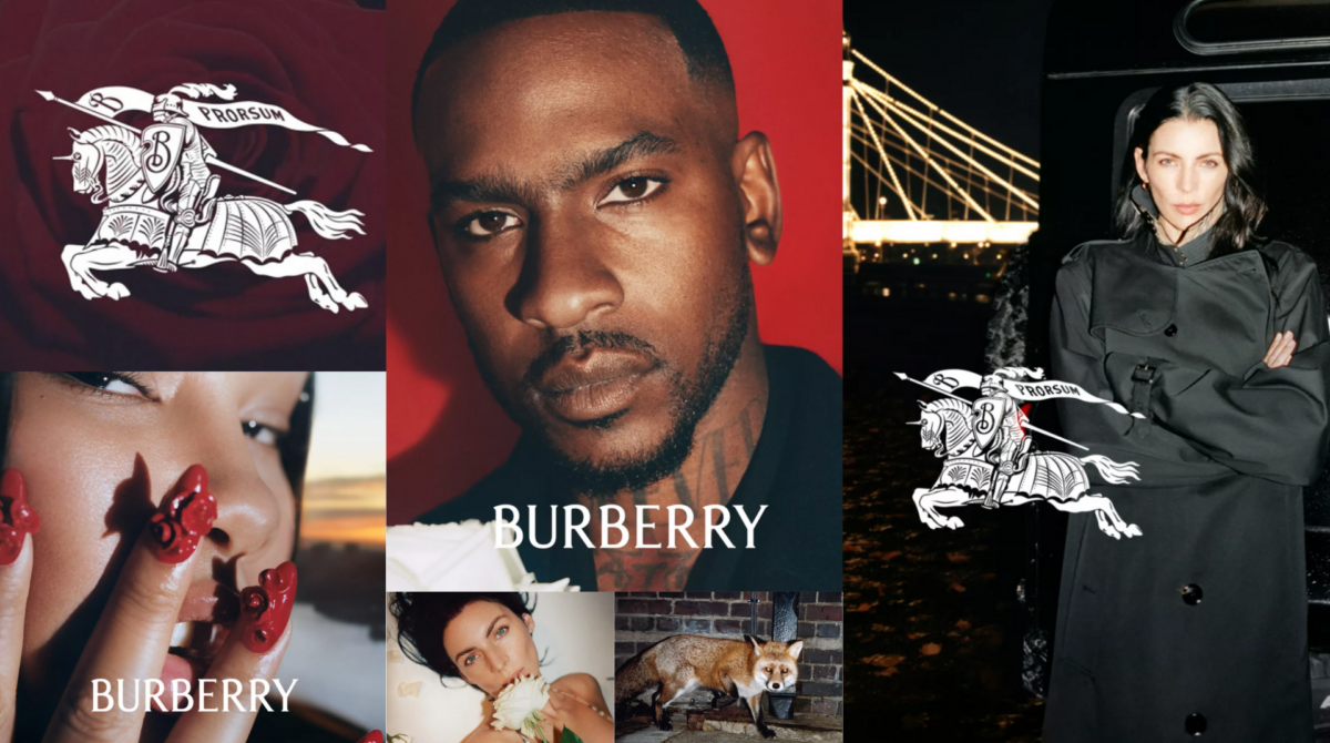
4. Burberry
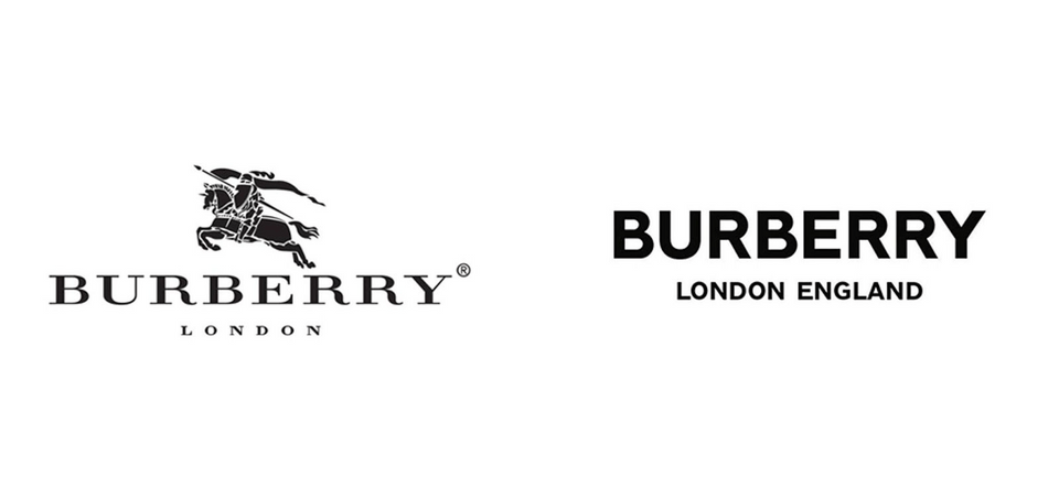
Having got to the fourth logo of this rebranding blog I’m quite worried that I’ve exposed myself as a very boring guy with my choices but I just love clean design. My dream is a bright white utopian world with sans serif fonts and maybe… just maybe... Burberry heard my dream and made it a reality. Their new branding is clean, WHITE and minimal. This rebrand was a big inspiration for my personal branding that I had to create for my university degree. Some may argue that the old Burberry logo is a classic and they have spoilt their legacy but in my opinion the new logo is just so much better.
The old knight and equestrian-themed logo, symbolises purity, honor, pride and grace, which is all well and good, but in my opinion any horse logo just reminds me too much of Ralph Lauren. I also feel like the typography looks warped and stretched which obviously triggered this overwhelming OCD of mine so, of course, I welcomed the balanced and aligned sans serif font in the new logo.
The new type sits tight together and has a nice spacing between the brand name and sub line ‘London England’. This logo fits well into the new branding overall too with the website being very fresh with large high quality images and a white background. I really love the new direction Burberry have gone in and this has been followed by other famous brands like Yves St Laurent and Balmain.
*Disclaimer* I didn’t put this rebrand in my list for free clothes but Burberry if you do want to send me free clothes as a thankyou for my kind words my email is alex@slice.marketing
5. Starbucks
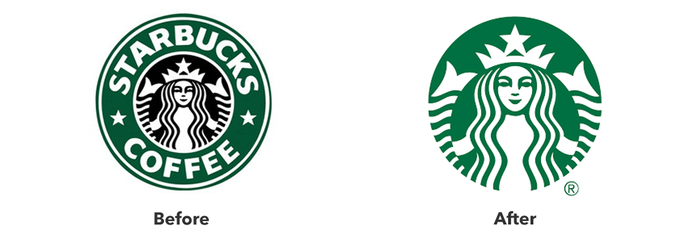
I can assure you this isn’t a mistake. I have put a logo that doesn’t include a sans serif font in my top 5 list. I really didn’t think it was possible but here we are. My OCD has been satisfied by a logo with character and uniqueness.
The old logo for Starbucks just felt too squashed together so I am a big fan of removing the Starbucks name and making the mermaid larger. However, this was only possible because the brand is so recognizable I wouldn’t recommend a logo without the brand name to a startup or small business unless the icon makes it totally clear what products or services they offer.
This brand refresh has also had a slight colour modification with the green being made lighter and friendlier in the new logo. Many brands have adopted the approach of lightning their colour schemes in the last five years or so. This has been driven by phone and computer screens being brighter and having better resolution, making brand colours of 10+ years ago feeling dull.
The illustration has also been modified with the face feeling more spacious, clearer and the lines being more symmetrical and balanced.
Conclusion
Simplicity is the future of design. However, the complexity of the customer’s perception is something that designers and marketers must always consider.
At Slice, we do everything to ensure branding is modern, effective and aesthetically pleasing. If you are interested in a rebranding, call us on
01482 014 304 or email
hi@slice.marketing